Curiox - Case Study
A Digital Transformation Elevates Brand and User Experience
We helped Curiox revamp their website to align with their innovative technology offerings and completely transform their customer experience.
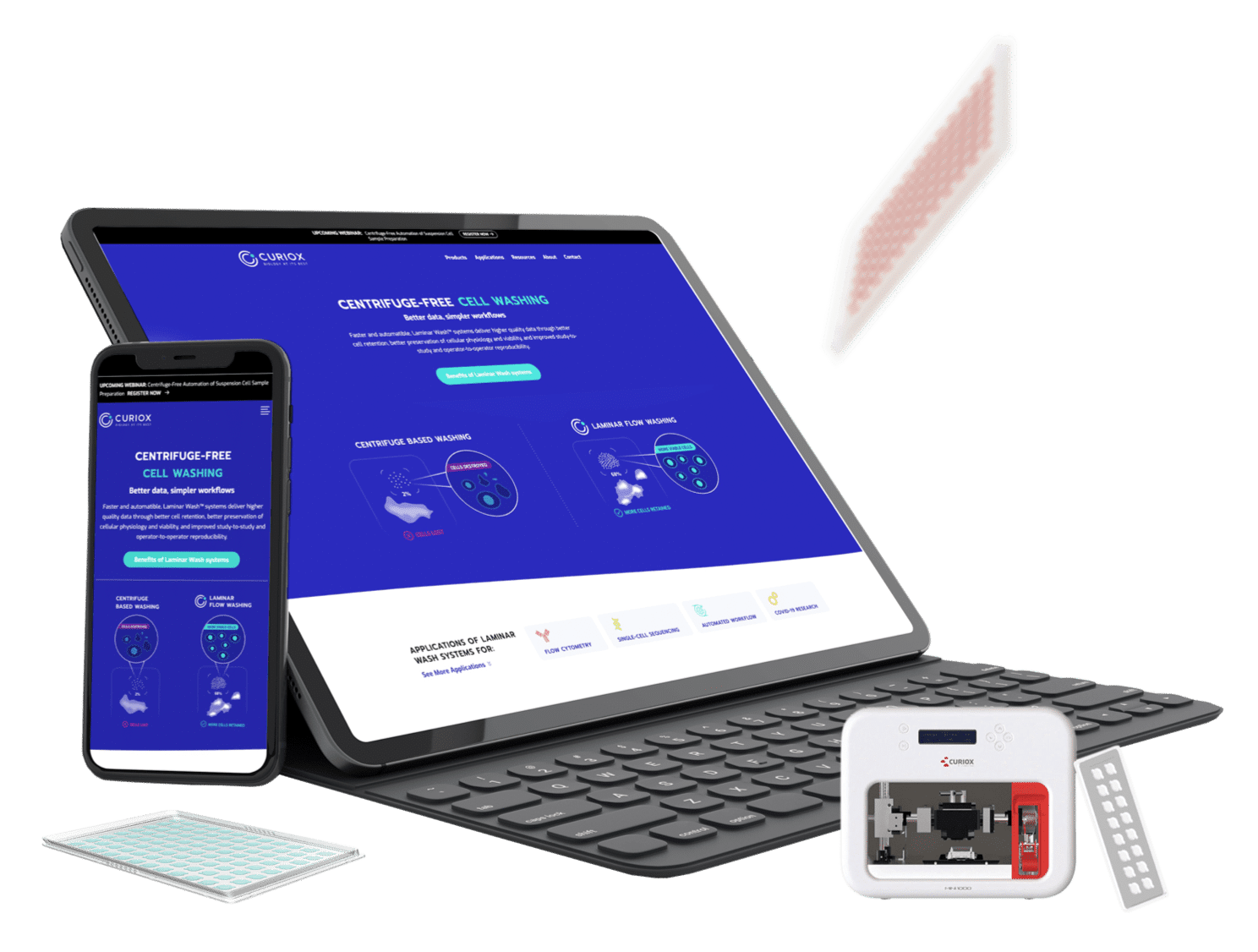
Web Services
- Marketing Web Design
- Digital Strategy
- WordPress Development
- Hosting and Support
- Search Engine Optimization
Meet Curiox BioSystems
Curiox is a Massachusetts-based company bringing automated cell processing and high-throughput cell analysis to life sciences laboratories worldwide through their Laminar Wash™ technology.
With over 12 years of experience solving bioassay bottlenecks, Curiox has the goal of accelerating the pace of life science research, diagnostics, and therapeutics discovery and development by miniaturizing and automating common assay steps.
The Challenge
- The website was not meeting their needs and it was difficult to make changes. It had a dated design and was very instrument focused, with messaging that was unclear to customers.
- The website lacked organization and searchability, making it difficult to navigate.
- While there was data on the website, it lacked context and clarity, creating a gap between what the technology offered and what the users needed.
- Curiox needed a partner with exceptional design skills and expertise in implementing user experience best practices and SEO to boost performance and conversion rates.
The Strategy
- We started by interviewing customers, conducting stakeholder workshops, and performing SEO keyword research to develop a strong positioning statement and create messaging aligned with the customer journey.
- We built a SEO focused site architecture to highlight their Laminar Wash Instruments as well as the applications in different workflows.
- We focused on boosting the credibility of the benefits and gave the customers clear reasons to buy the products.
- We used content marketing best practices that would drive awareness, education, and trust, and we made it easy for users to navigate through the site to quickly get the information they need.
The Results
- Curiox has a new website that is modern and bold. It elevates the brand, and is built to meet the needs of the business and customers.
- We knew our design and UX strategies would work, and we championed our ideas, leading to rapid results in overall site sessions and page rankings.
- Average keyword position increased by 25 within one month
- Overall sessions are up 65.87% in 1 month since launch, with >85% boost in users, ~90% boost in new users, >65% increase in sessions.
- The website is easy to update, so Curiox can efficiently make changes as they need to and add new resources into their resource hub as they are generated.
"It flows better and traffic is up."
"We like how it looks and flows, and it is much easier to make changes to the website. Leads have increased, and the volume of direct traffic has increased 3-fold."

Charles Martin
Curiox, Sr. Director of Marketing

"It flows better and traffic is up."
"We like how it looks and flows, and it is much easier to make changes to the website. Leads have increased, and the volume of direct traffic has increased 3-fold."
Charles Martin
Curiox, Sr. Director of Marketing
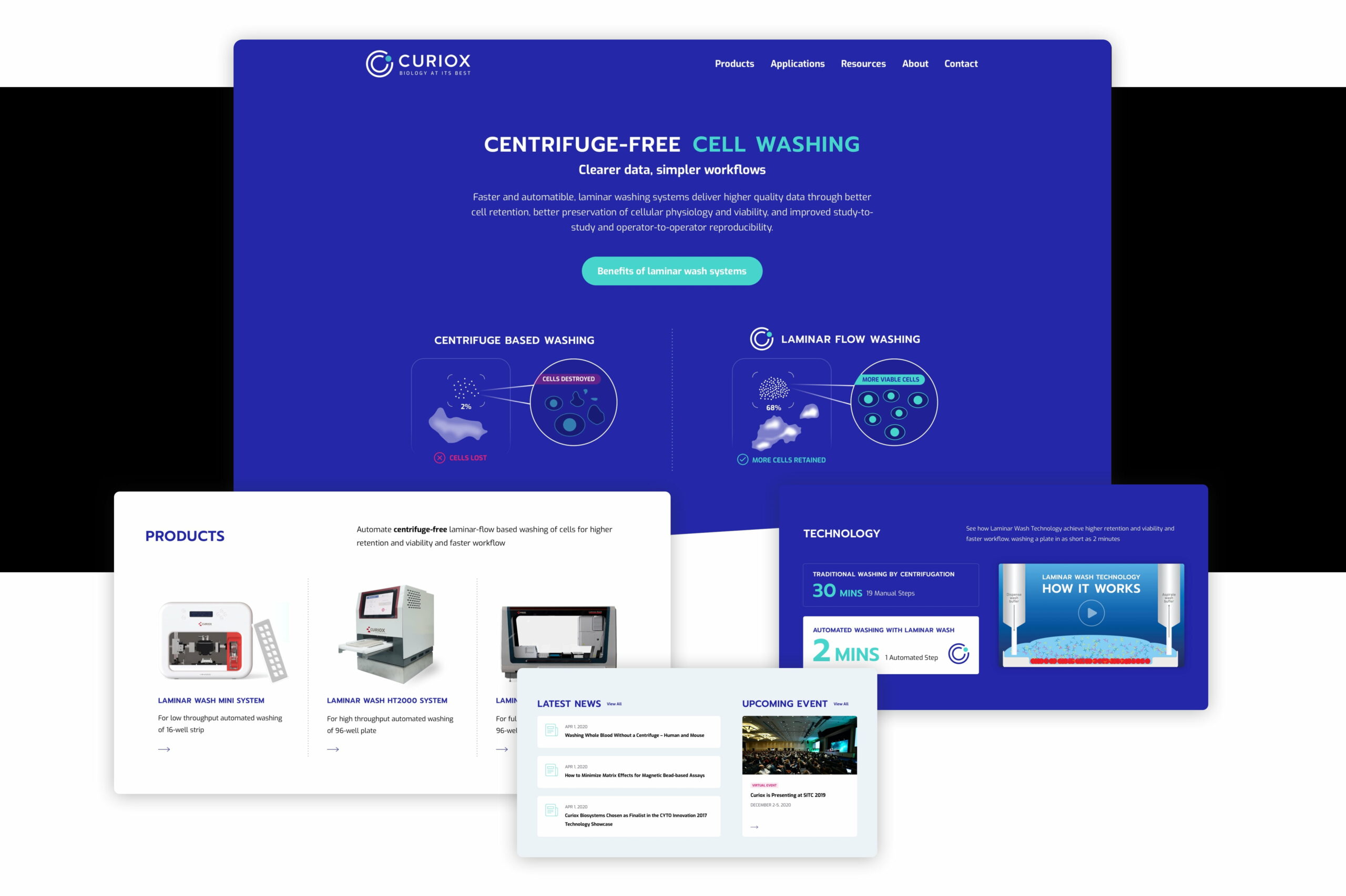
Homepage
The homepage sets the tone for the user and is often where they decide if they trust the company and find their technology useful. We wanted to give the homepage a modern look and feel while delivering a positive user experience and boosting the credibility of Curiox.
Because Curiox is offering a relatively novel product, we prioritized educating the user by immediately introducing the concept of the product offering. We make the benefits of the method clear by using user-centric messaging and bridging the gap between the technology and the user’s workflow.
Further, we organized the homepage into product and application areas, offering an easy-to-navigate path to help guide users into their next step in the buying journey.
Key client relationships and publications are often undervalued by life science companies, but these are highly effective in nudging users further into the buyer’s journey. To demonstrate Curiox’s reputation and expertise, we created “Trusted by” sections and highlighted their recent publications.
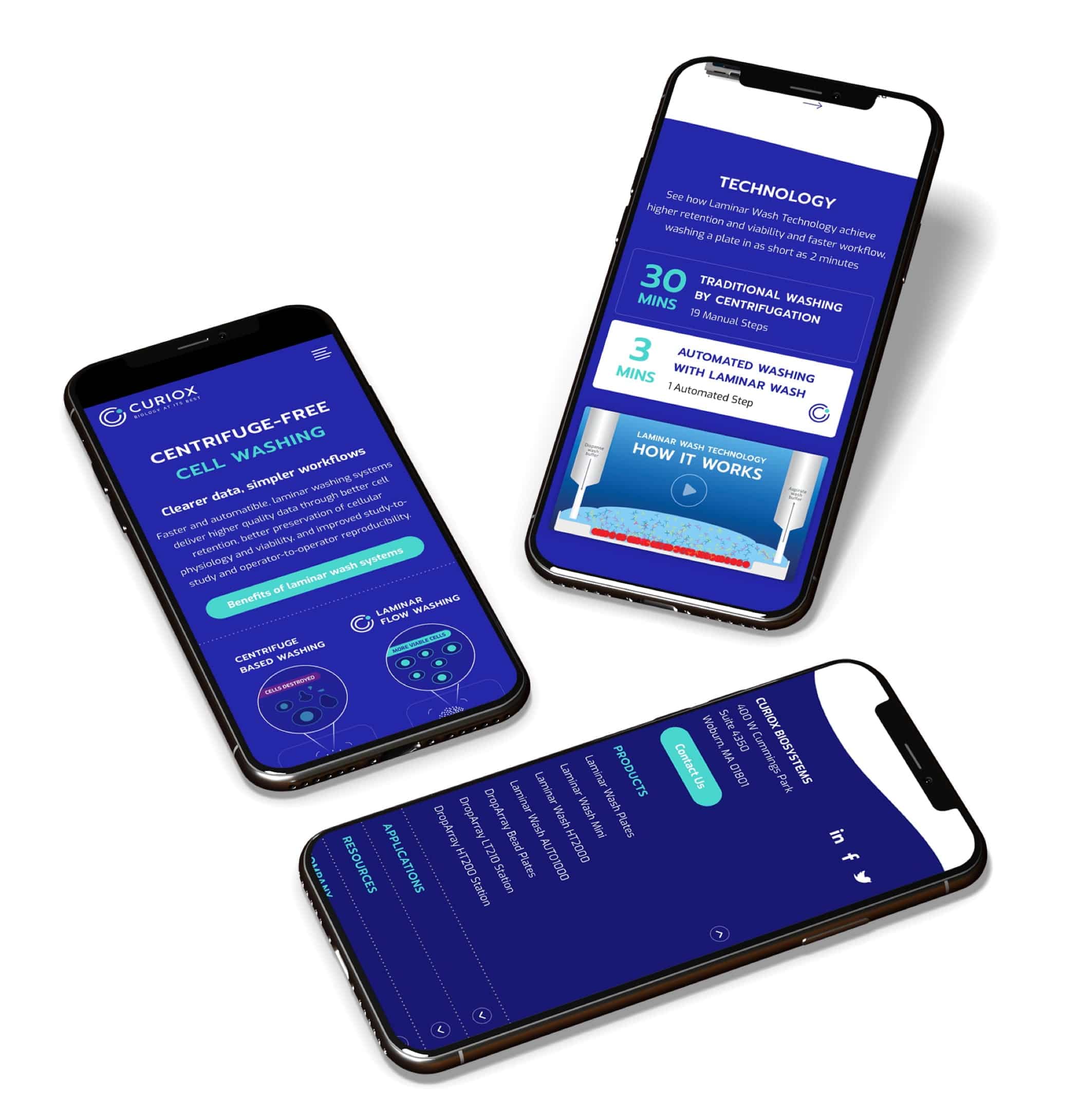
Mobile
In Life Sciences, users predominantly use desktop devices, however, with Google switching to mobile-first indexing, it’s more important than ever to have a responsive website on any portable device. With our process and experience, we’ve delivered a website that is fully mobile responsive and replicates the same intuitive experience one would get on their desktop.
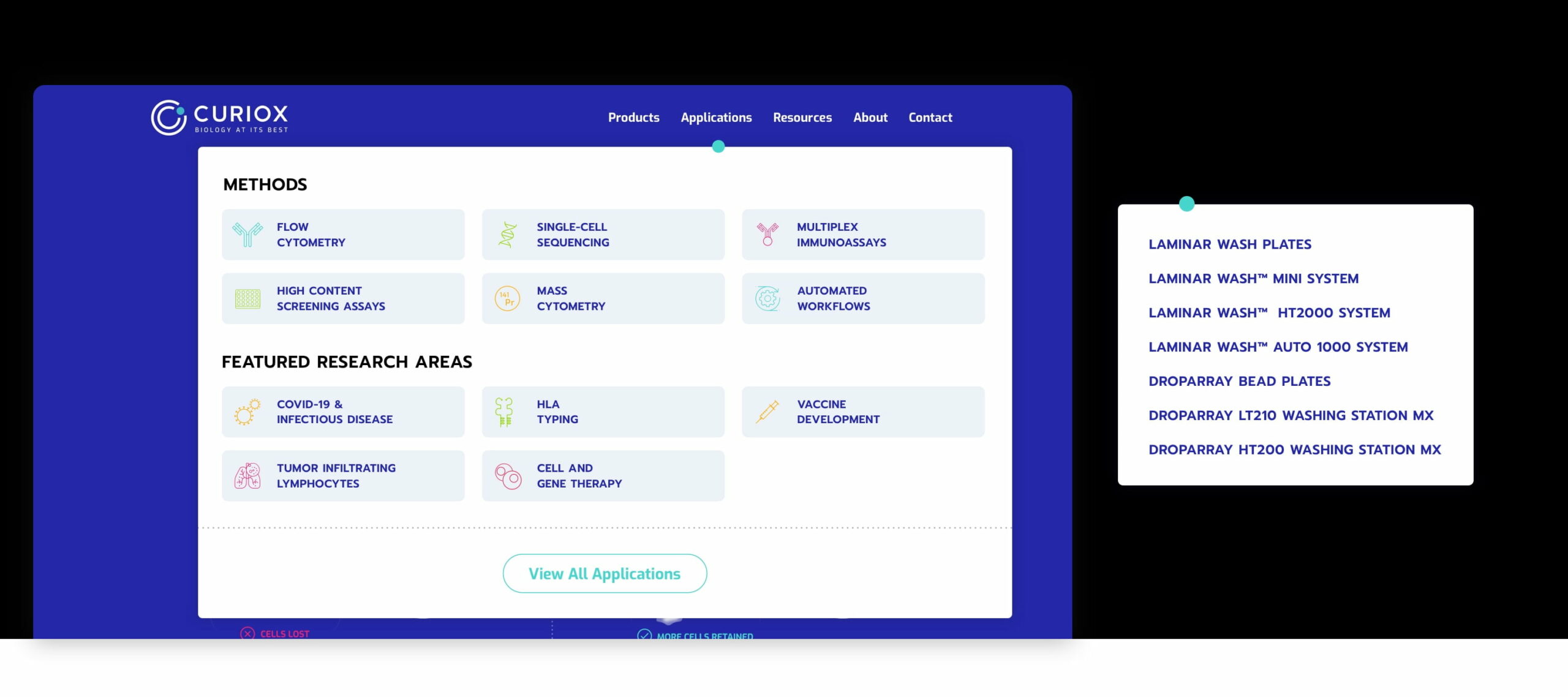
Navigation
Previously, Curiox’s website lacked categorical organization, making it difficult for users to figure out how to get to the information they needed.
Through customer interviews, SEO keyword research, and value-based design practices, our Ph.D.-level team created an intuitive architecture. Each product and application page offers easy-to-digest educational, technical, and scientific information while making it quick and easy to navigate to relevant resources.
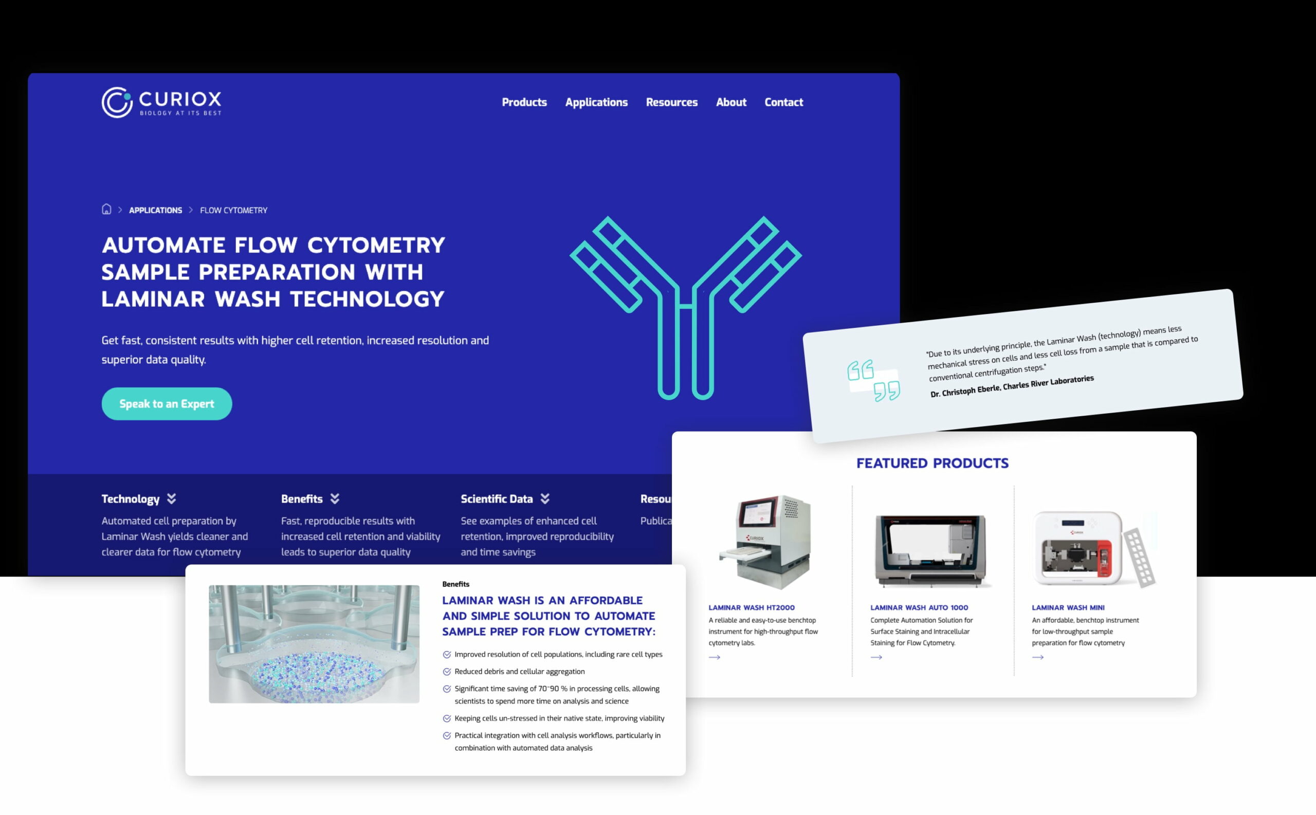
Category Page
Category pages play an important role in the user experience, as they are often an entry point from the search engine. We used SEO keyword research and messaging that aligned with customer needs so users could immediately understand how the technology works, the value of the products, and where they needed to navigate.
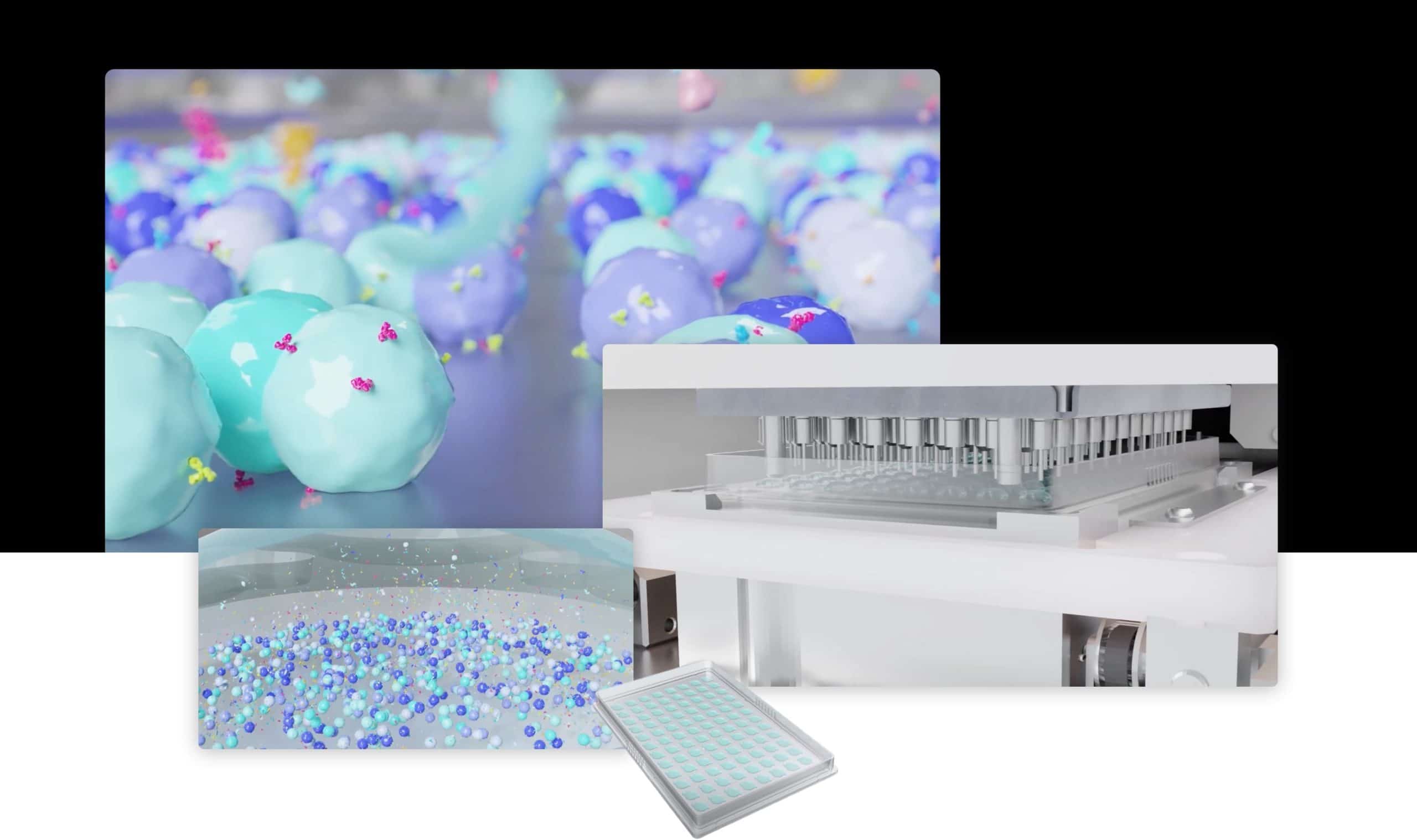
Technology Video
Educational content is a critical part of nurturing users through the buying journey—and it needs to be engaging.
We leveraged our partnership with Alpha Tauri 3D graphics to modernize Curiox’s technology video—a key asset on the website that offers an engaging piece of content on how the technology works. This helps engage potential customers, builds confidence in the products, and can spark viewers to see the product as a viable option for addressing their needs.
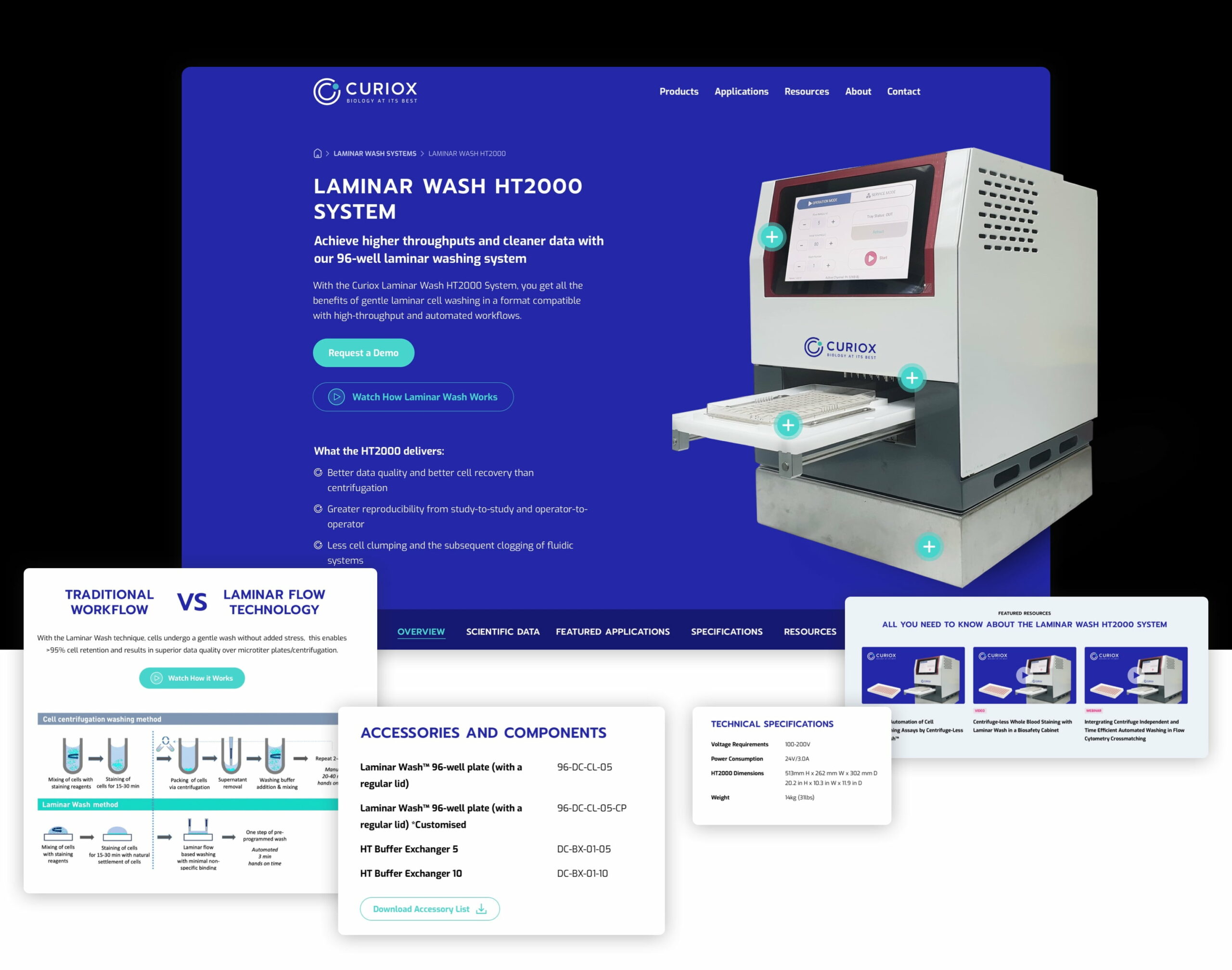
Product Page
The product pages were reorganized and revamped with messaging that would speak directly to the needs of the customers while demonstrating the performance of the product. We led with the value the product brings directly to the user and offered clear opportunities to understand how the technology works.
Further, we made it easy to find the data generated by the product and technical specifications by using a click-and-scroll feature rather than hiding key information behind tabs.
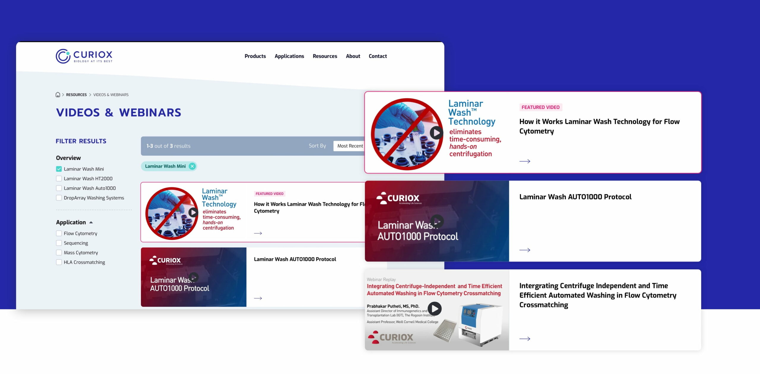
Resources
Curiox’s resources were difficult to find on the old site. When users did find the resources section, customers had to search through long lists of titles to try to identify relevant information.
To future-proof the site and allow Curiox to continue building out new resources, we created individual pages for Publications, Videos & Webinars, Posters and Technical Notes. On each resource page, users can filter by product and application—it’s better and faster than ever for their users. We also added descriptions and maximized SEO of many of these key assets to boost organic traffic.
"Supreme Optimization delivered."
"“We are happy that Supreme delivered what was promised, and we appreciate the technical knowledge of their project managers—our questions were answered immediately.“

Charles Martin
Curiox, Sr. Director of Marketing

"Supreme Optimization delivered."
“We are happy that Supreme delivered what was promised, and we appreciate the technical knowledge of their project managers—our questions were answered immediately.“
Charles Martin
Curiox, Sr. Director of Marketing

