Website Design & UX, White Papers
4 Minutes
6 Web Design Trends in 2016 for the Life Sciences Industry
There’s certain challenges when developing and designing a website for the life sciences field. The bottom line for a website is that it must effectively and intelligently communicate the companies message to their target audience.
However, there are often challenges and communication gaps between designers in understanding the unique needs of a life science company.
Over the past five years, I’ve spent hundreds of hours browsing, consulting and developing some of the top websites in life sciences. Most websites have areas that they excel in, and areas that could be improved. Below, I’ve outlined a few of the best aspects of a handful of my favorite sites in the field of life sciences.
WWW.EMERALDCLOUDLAB.COM
Who:
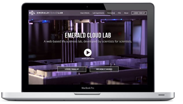
Emerald Cloud Lab is one of the most innovative companies I’ve come across in the field of life sciences. They’ve created a cloud based science lab that can automate experiments from anywhere in the world.
Why we love it:
What better way to explain exactly what they do through an auto-play homepage video that provides a visual of their cloud lab at work?
Even better, they’ve invested in producing creative video that explains what they do visually instead of reading it. One more thing…the site scores a stunning GTMetrix page speed score of 97%. Who says sites with video can’t be exceptionally fast?
The bottom line:
If you have any worries about explaining what your company does to your audience, use video as a visual medium to better illustrate your point.
WWW.BLUEBIRDBIO.COM
Who:
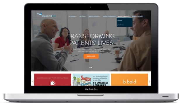
BluebirdBio is one of the leaders in gene therapy with integrated product platforms encompassing gene therapy, cancer immunotherapy and gene editing.
Why we love it:
What strikes me the most about BluebirdBio’s website is the consistency in the brand identity throughout the entire website. Company culture is beautifully illustrated with warm, simple fonts. With the newest CSS/HTML5 coding, pages are reactive and respond to when you hover over them. Meanwhile, the homepage is filled with real photos of the CEO and employees.
The bottom line:
Stay away from too many stock photos. Hire a photographer to spend a day or two at your company to capture real photos. This will give your website a sense of authenticity and company culture. Utilizing new CSS/HTML5 features may add some small friendly personalized touches to your website.
WWW.MABPLEXINC.COM
Who:
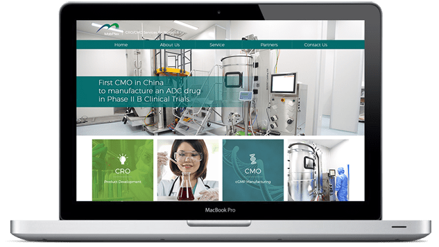
MabPlex provides global CRO/CMO services in development and manufacturing of biopharmaceuticals. They’re one of the few providers for large-scale ADC production worldwide.
Why we love it:
Responsiveness. Last year Google confirmed that mobile device browsing has surpassed desktops in 10 countries including the US and Japan. Furthermore, mobile usability plays a significant factor in search engine optimization keyword rankings. MabPlex’s website is fully responsive on every platform which makes it functionally extremely user-friendly.
The bottom line:
In 2016, it should be a given that your website will be fully responsive on any mobile device across generations and screen sizes. If you have e-commerce on the website, those customizations must also be fully mobile friendly.
WWW.ACDBIO.COM
Who:
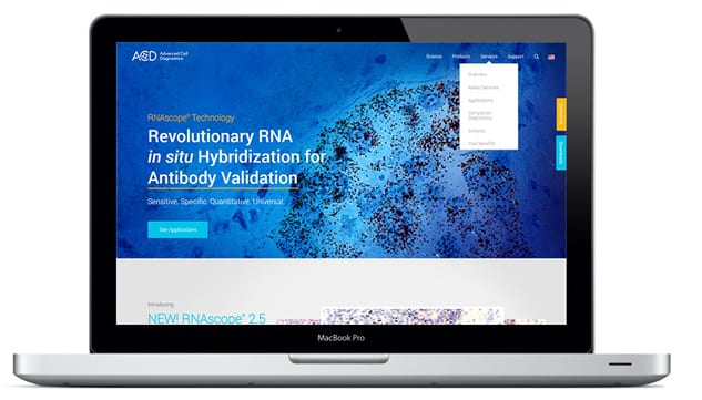
Advanced Cell Diagnostics is the leading provider of RNAscope®, an award winning RNA in situ detection platform. They offer over 10,000 in situ hybridization probe sets spanning a variety of species.
Why we love it:
AcdBio’s RNA in situ detection platform provides beautiful high resolution images. There’s no better way to illustrate these with a full screen, high resolution hero image with one clear call to action. There’s a reason why sliders are being replaced into hero images. In a study at the University of Notre Dame’s official website, of 3.7 million visits in six months, only 1% clicked ANY of their slider images.
The bottom line:
Studies have shown hero images are substantially more effective than sliders. Instead of showing multiple options and banners, just provide one clear call to action above the fold for better click through rates.
WWW.ALTHEACMO.COM
Who:
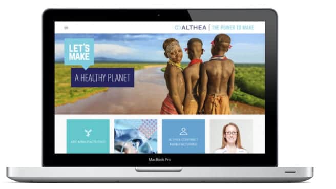
Althea is a leading expert in aseptic filling of drug product in vials and syringes, and their focused expertise and capabilities make them one of the industry’s top leaders for cGMP microbial-based manufacturing of recombinant proteins and plasmid DNA.
Why we love it:
Simplicity is key. Althea utilizes colored card designs to signify each core competency of their company as well as a hamburger menu design. Their site is extremely straightforward and minimalistic while delivering a clear message of their process.
The bottom line:
Even though your products and services might be complex, your site should be as straightforward as possible. People have limited attention spans and the clearer your point is, the better user retention rate. The new hamburger menu trend diverts attention to the lower elements instead of the mega-menu. Remove clutter and non-essential elements to provide a more user-friendly interface.
WRAP UP
It is often a requirement for life sciences companies to present complex products and services with simplicity and elegance. Communication gaps between front-end designers and developers can cause complications during the web development and design process. The bottom line is that if possible, try to work with a specialty company that has worked in your field before.
Supreme Optimization specializes in web development for life science companies. Our impressive client list in the life science industry speaks for itself. So, find out more about our web design and online marketing services by scheduling a free 1-on-1 consultation.
Related Posts
Get a Quote or Ask a Question
- Curious about our process or pricing?
- Need help getting buy-in?
Contact us right away — we’d love to help.
Let’s take a look at your website together and figure out your best options for business growth.

Contact us right away — we’d love to help.
Let’s take a look at your website together and figure out your best options for business growth.

