DWK - Case Study
DWK Global eCommerce Launch
DWK Life Sciences is one of the world leaders in premium laboratory glass. Their product portfolio comprises over 30,000 products manufactured at 11 sites in Europe, North America and Asia.
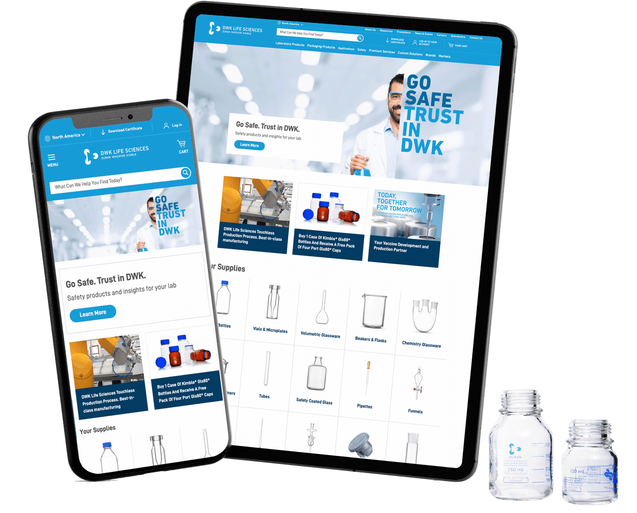
We built DWK a premium website to align with the quality of their premium products.
Web Services
- eCommerce Web Design
- Website Audit
- Magento Development
- Hosting and Support
- Search Engine Optimization
The Story
How DWK Transformed Three Brand Websites into One Global eCommerce Store
The Challenge
DWK had three separate brands sites with sub-optimal navigation and architecture.
Product information was not easily found, which was having a negative impact on customer experience and online sales.
The Strategy
We audited Google Analytics, interviewed customers, and conducted a UX competitive analysis.
Then we designed the site using UX best practices and rebuilt the product database with user friendly filters and SEO focused categories.
The Results
3 power-house Brands, DURAN, WHEATON and KIMBLE, were unified into an SEO-focused eCommerce platform for DWK.
The new store is built to meet the needs of both their business and customers.
"Significant, drastic, improvement."
“The new Global DWK eCommerce store is a significant, drastic, improvement. It looks better, it’s faster, and allows customers to get to products faster.”

DENNIS BECKEDORF
Director Marketing Communications

"Significant, drastic, improvement."
“The new Global DWK eCommerce store is a significant, drastic, improvement. It looks better, it’s faster, and allows customers to get to products faster.”
DENNIS BECKEDORF
Director Marketing Communications
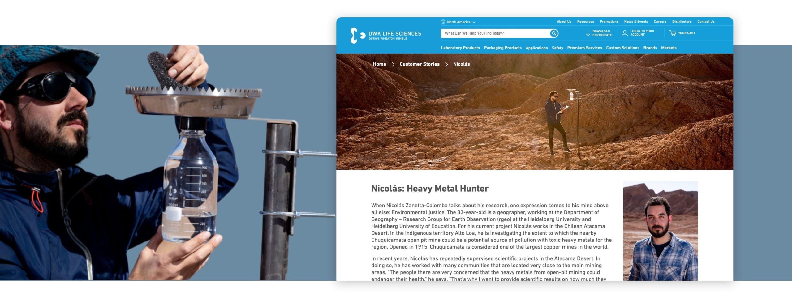
What makes DWK unique is not only their legacy of quality laboratory glassware, but also the number of ways their products are used in the field. The #CompleteThePicture campaign was designed to showcase the fascinating work being done around the world by DWK customers.
We created custom story pages that demonstrate the impact of the scientists' work in the field. Additionally, we created a campaign landing page that allows customers to submit an application to win a professional photo shoot.
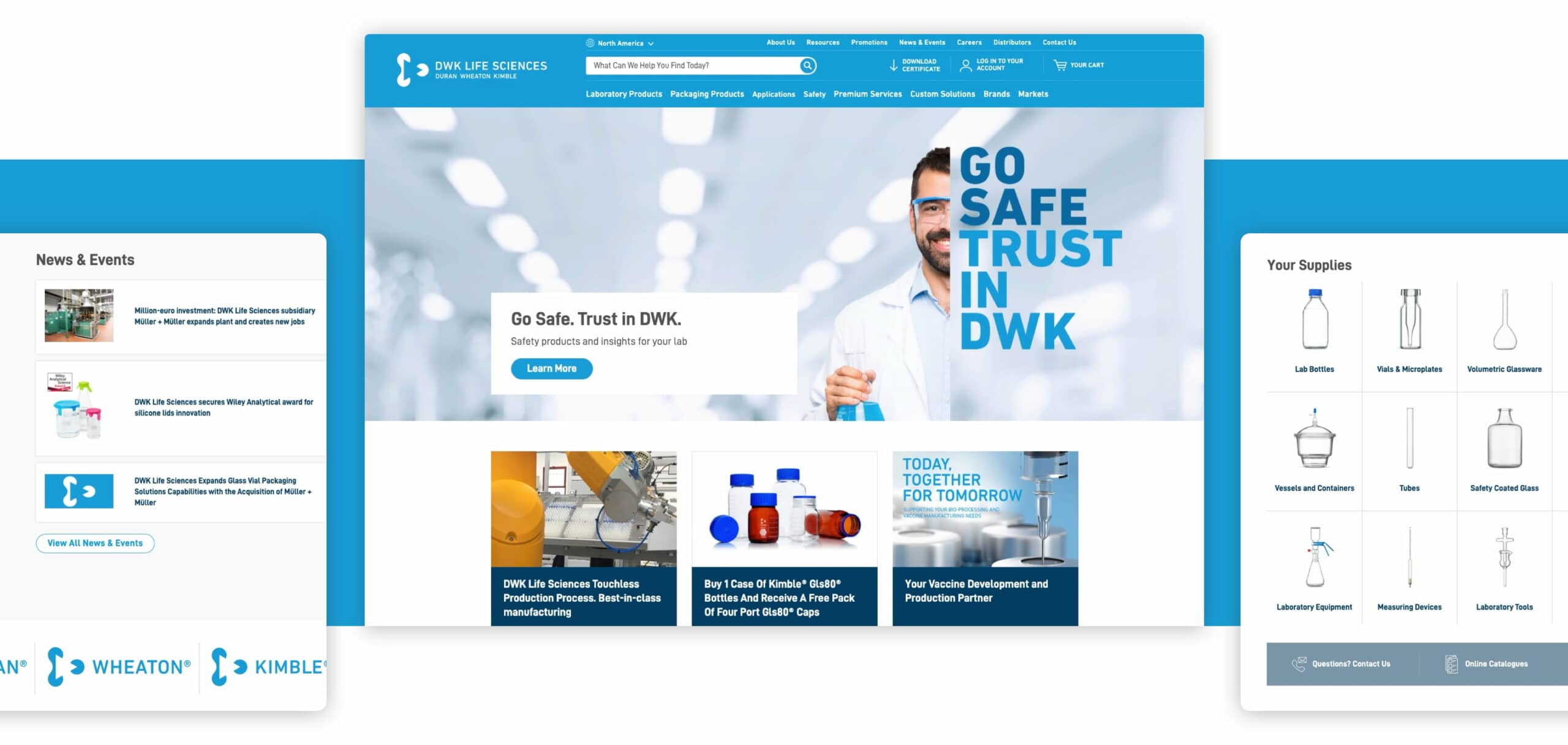
DWK Homepage
First-time website users rely heavily on the main navigation options and the homepage content to determine which type of site they've landed on and how broad (or narrow) a product range it offers.
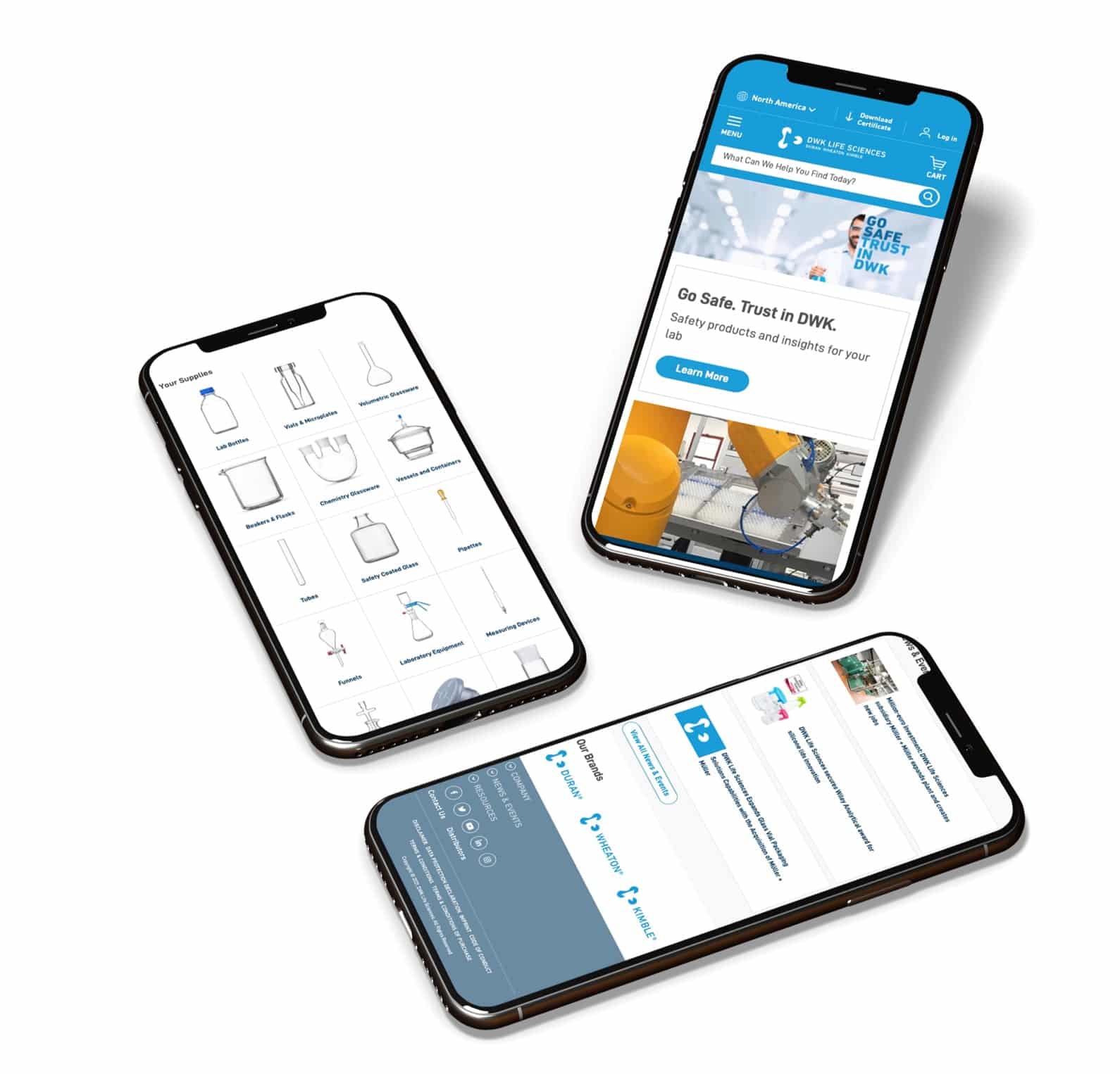
In this homepage layout we feature the main product categories to give the user a clear scope of the product offering. In addition, a well organized product menu and robust search functionality helps guide users into their next step in the buying journey.

"Supreme was reliable, responsive and never broke a deadline."
"I trust supreme and always felt safe. I never felt that they would work in a direction I didn't approve of. Supreme was reliable, responsive and never broke a deadline."
DENNIS BECKEDORF
Director Marketing Communications
"Supreme was reliable, responsive and never broke a deadline."
“I trust supreme and always felt safe. I never felt that they would work in a direction I didn’t approve of. Supreme was reliable, responsive and never broke a deadline.”

DENNIS BECKEDORF
Director Marketing Communications
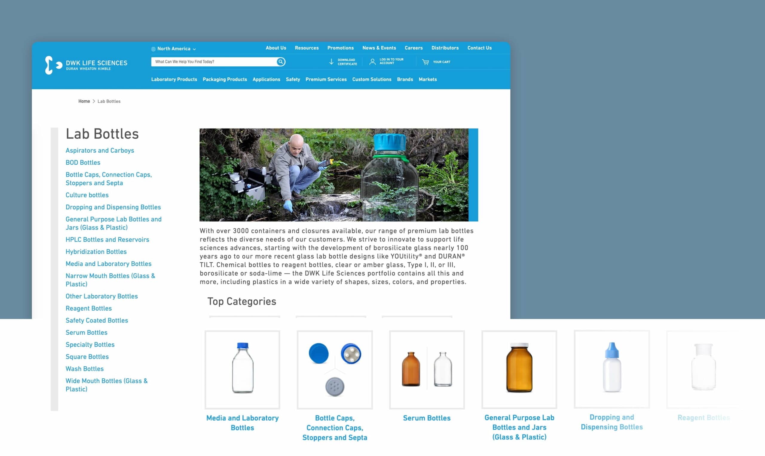
Category Level Landing Page
When users land on an intermediary category page, they exhibit much of the same behavior as they do when landing on the homepage – they try to infer the category taxonomy, the breadth of what the particular category offers, and which path will suit them best.
Despite their value, 32% of e-commerce sites still don’t have any kind of category pages. This was the case for DWK’s old brand websites. In the new DWK store we added search engine optimized category pages that list subcategories and feature photos of top categories.
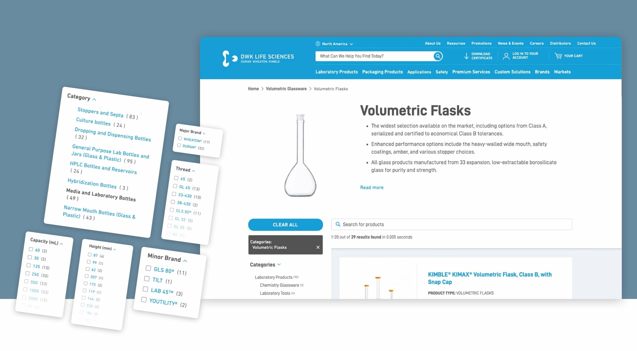
Search Listing Page
The goal of a high quality search listing page is to enable users to make an initial assessment of the results before moving into the next step of the buying journey. The user should be able to refine their search as needed with helpful filters.
For the DWK search listing page, we’ve provided high quality images and truncated filters that allow for a high level of filtering specificity without overwhelming the user with an expanded list of all selection options.
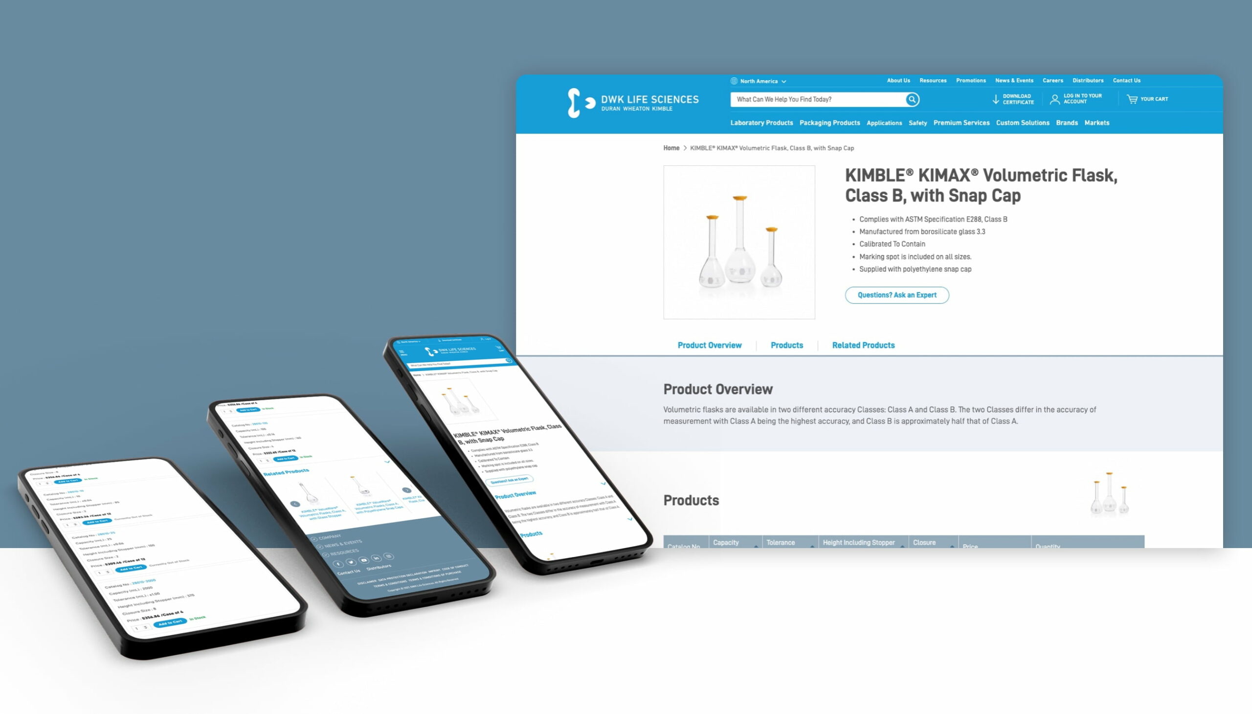
Product Description Page
The overall product page layout greatly impacts a site’s UX performance. Usability testing shows that poorly executed product page layouts are the primary reason for product and site abandonments – simply because the users couldn’t get an overview or weren’t able to locate the desired content.
After comparing competitor product layouts and conducting voice of customer interviews and usability testing, we learned that users needed an easy way to scan for product specifications. Here the product specifications are open and not hidden behind tabs. Users can either scroll though the content or click “specifications” which automatically scrolls them to the specifications table.

