Digital Strategy, Website Design & UX
11 Minutes
6 Life Science Digital Marketing Trends: 2019
Supreme Optimization works with the top life science companies in the world. Here are 6 life science digital marketing trends we’ve observed in 2019.
To kick off 2019, we shared the popular blog post recapping the lessons we learned in 2018: 5 Lessons I Learned from Working 24/7 with the Top Life Science Companies in 2018.
As we’ve continued through 2019, we’ve noticed some interesting new trends emerge:
- Is LinkedIn the New Google?
- Digital Transformation Is an Iterative Process
- Content Rich Product Detail Pages
- Upsells & Cross Sells on Product pages
- Live Chat in Bottom Right Corner
- The Big Guys Are Doubling Down AdWords (Up 200% from 2017)
Let’s dive in…
1. Is LinkedIn the New Google? … A Story…
As an agency for the last 2-3 years, Google Ads was by far our most popular paid advertising offering. But in 2019, for the first time ever, we are getting equal requests for Google and LinkedIn.
But why?
Recently, our Chief Advertising Officer was visiting our clients in Silicon Valley when he made an interesting discovery.

Eric Southwell, our Chief Advertising Officer, and Cancer Biologist Gus Frangou from Harvard University
They discussed how social networking is essential for researchers. Importantly, they discussed the merits of different media platforms as tools for establishing scientific collaborations & letting other individuals and/or groups find out more about their research, including potential funding opportunities.
“LinkedIn represents an “untapped” resource to identify individuals with similar skill sets or synergistic interests.”
Gus Frangou asked Eric if Supreme provided any services around building up LinkedIn profiles for clients…
Eric replied, “Well, we run TONS of ads for clients but we don’t actually build up profiles, but why would we want to offer that as a service?”
“You have a better likelihood of getting funding with a strong presence on LinkedIn”
In other words, organizations who distribute grant money now view an individual’s LinkedIn presence as one (of the many) deciding factors for distributing funding.
If you think about it, this makes a ton of sense. People who distribute grant money want their research to be heard.
As a result, scientists are hanging out and sharing information on LinkedIn more now than ever before.
LinkedIn has also taken notice of the rise in scientists on the platform and it even has a specific section in a user’s LinkedIn profiles for scientific publications. Within the publications section, users can add additional authors and a link to the PubMed article.
Update:
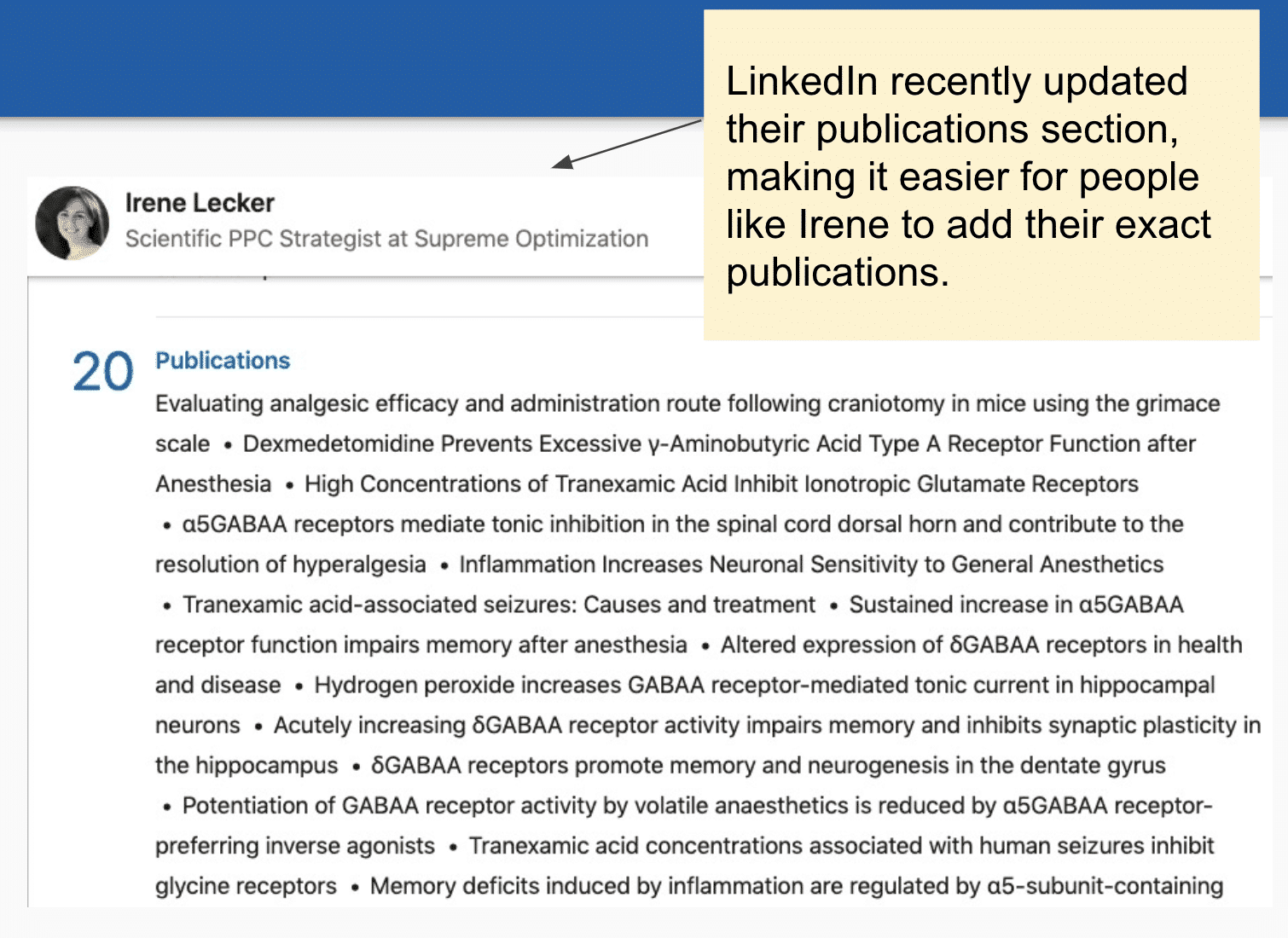
LinkedIn recently updated their publications section, making it easier for people to add their publications

With the rise in scientists on LinkedIn, this leaves an enormous opportunity for life science advertisers to get in front of their target market with lead generation campaigns for their products and services.
LinkedIn For Life Sciences Summary
Scientists are hanging out on LinkedIn now more than ever, so it is a great place for lead generation campaigns for life science companies.
LinkedIn is great for customers who aren’t searching for your product or, more importantly, when they don’t know your product exists.
Great for getting in front of specific “dream accounts” (to target specific companies, educational institutions, etc..).
LinkedIn = largest deals; Google = fastest deals
Need to reach scientists with LinkedIn Ads? Contact us today. We’re happy to chat!
2. Digital Transformation is an Iterative Process
The second trend that we’ve observed is that Life Science leaders are advancing their digital transformation with a “measure and iterate” approach.
This means incremental improvements based on analytics tracking, customer feedback, and automation tools to increase online revenue and de-risk design decisions.
We’ll look at Abcam as an example:
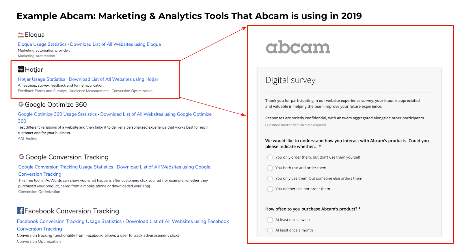
One of the first things we noticed is that Abcam is using Hotjar to collect customer feedback. Hotjar is a great way to collect real time feedback to understand the customer journey and ultimately make informed improvements to your online shopping experience.
In order to illustrate the “measure & iterate” approach, we looked at how Abcam’s homepage has evolved over the years:
Abcam: Share Price
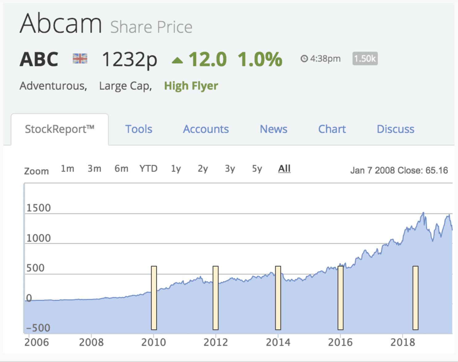
The yellow markers above show where the homepage snapshots were taken over time.
Abcam: Homepage 2010
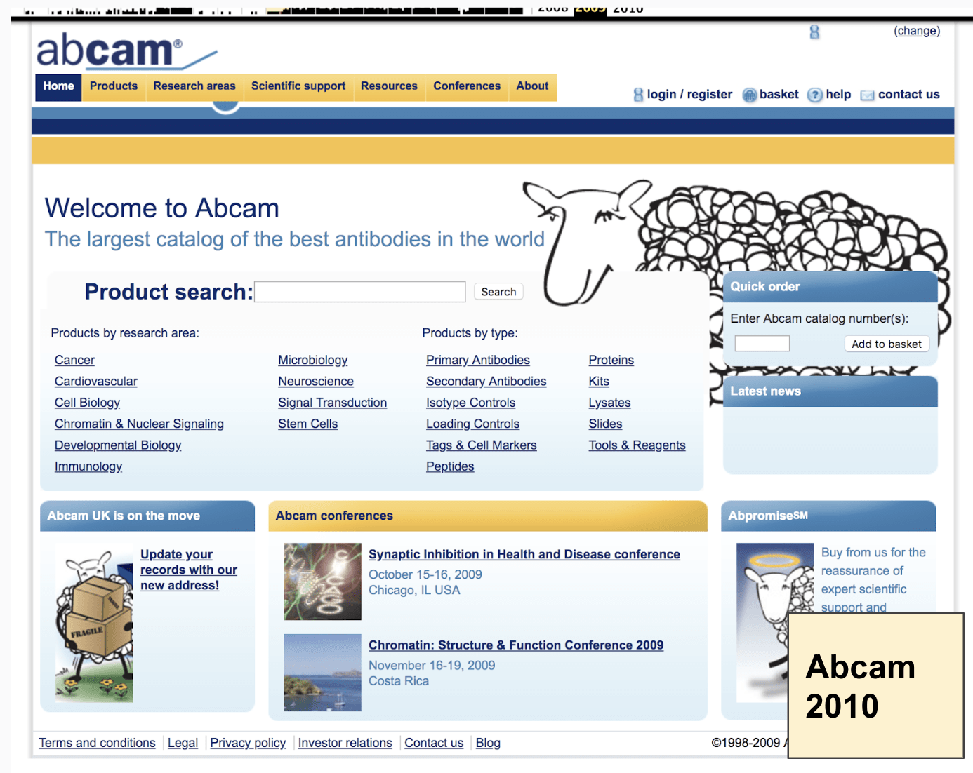
Take particular note of the emphasis on the search bar over time.
Notice how on the earlier versions of the homepage, there is no clear visual focus of where the user should go first. There’s an overwhelming amount of options to click. Each additional option to click dilutes the focus of the most high-value customer journey path.
Abcam: Homepage 2012
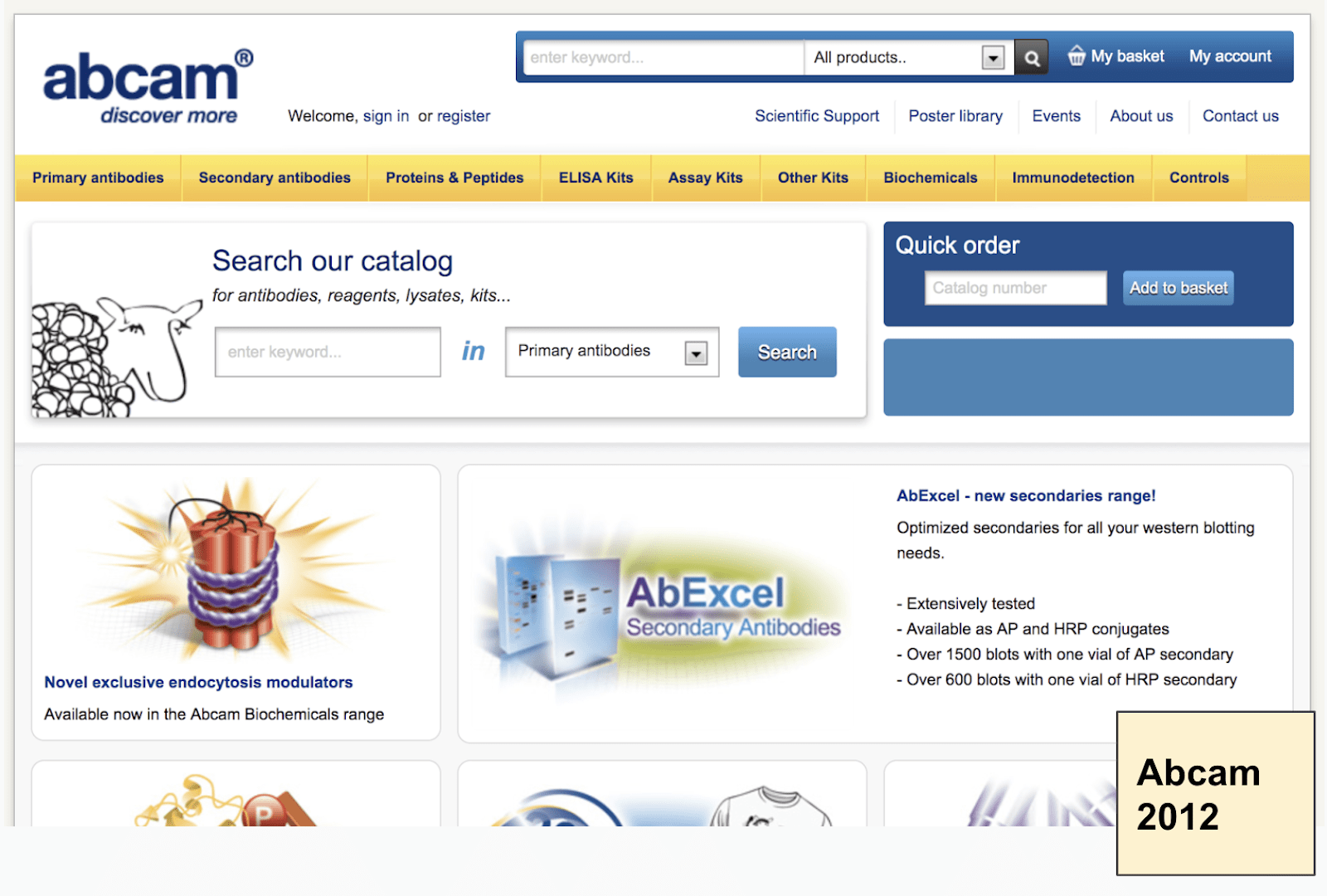
A search bar is added to the top of the navigation. The ability to search by product area is added.
Abcam: Homepage 2014
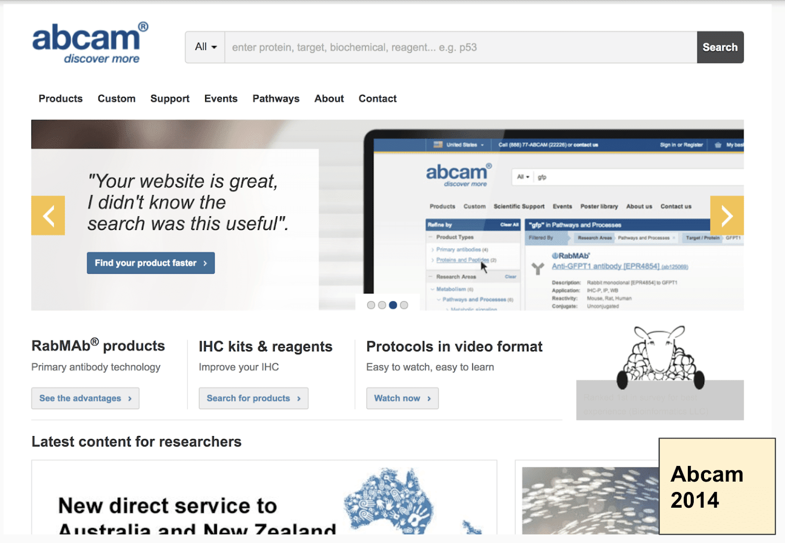
The search bar is now more prominent in the menu. The use of color focuses users on interacting with the banner (yellow) and clicking homepage links (blue).
Abcam: Homepage 2016
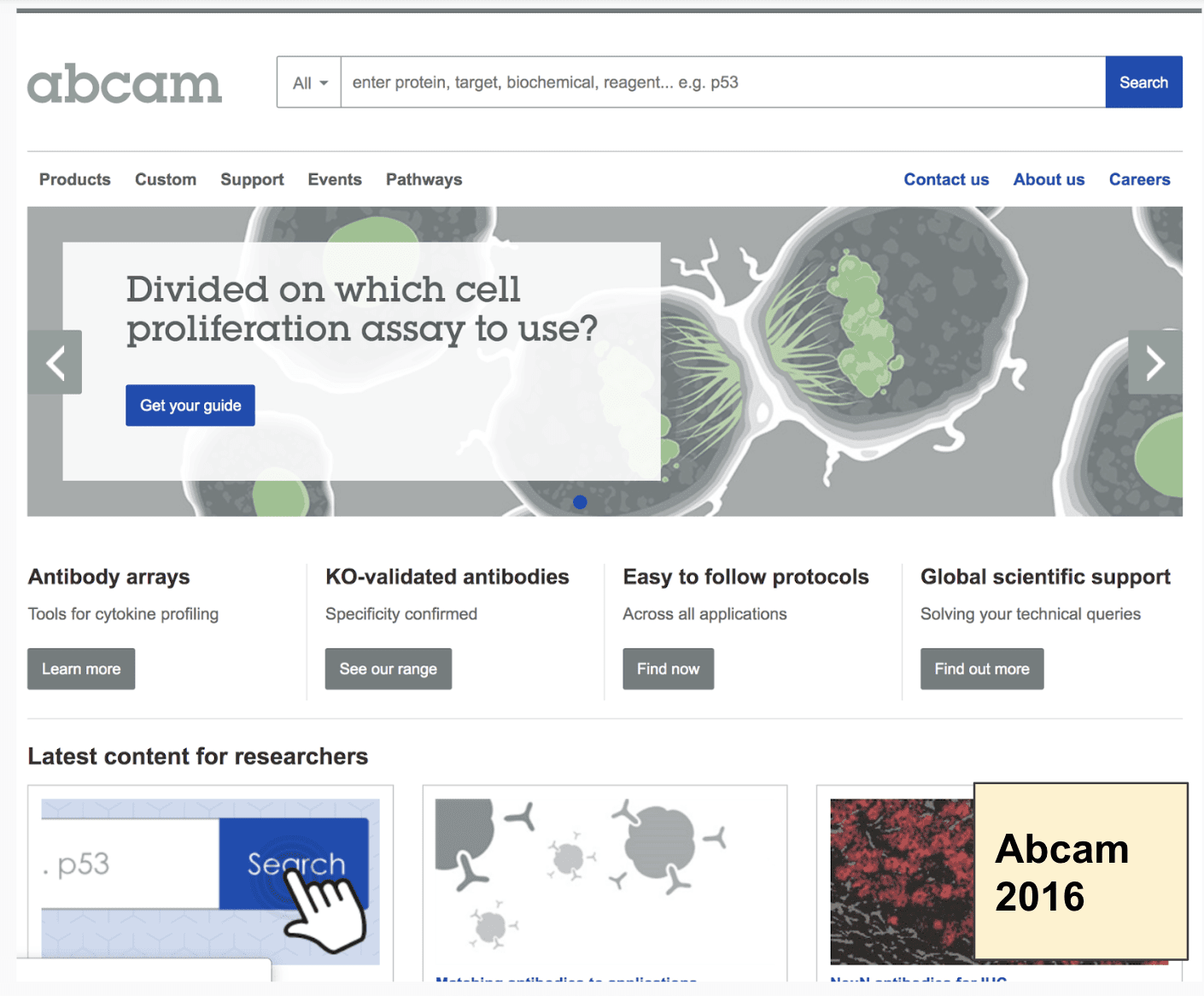
The search bar remains in a similar location, but the use of color (blue) is directing users toward engaging with the search. Internal links are muted as secondary Call To Actions (grey)
Abcam: Homepage 2019
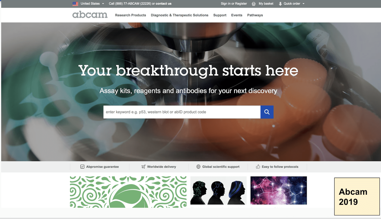
The search bar has now taken full prominence. Headline & subheadline work visually in a V shape to direct the user’s focus to the search bar, which is white on a darker background. The word “Search” in the CTA is replaced with a magnifying glass icon.
There are actually a few interesting updates to note on Abcam’s current homepage. In addition to the search taking the main focus, the category names on the menu have gotten more specific. (A good test of an optimized menu is if you covered your logo and showed a new user just the menu alone, could they understand what your company offers?)
“Products” is now “Research Products.” Products alone could mean anything. Research Products clues users into exactly what they can find here.
“Custom” is now “Diagnostic & Therapeutic Solutions.” Again, “custom” could mean just about anything, and it could be for any industry. This menu update gets straight to the point.
Finally, Abcam has added their key differentiators directly under the hero section. These are important for overcoming any last minute hesitations that users might face before buying (guarantees, worldwide delivery, global scientific support, and easy-to-follow protocols). The user can click on any of these to get the full details.
Update:
As of writing this post, ZAGENO has announced a major overhaul of their product categories.
According to the article:
“…life science suppliers will benefit from a category structure that more accurately reflects the structure within their own organization, allowing more precise classification of their portfolio on ZAGENO.”
You can see all of the product category improvements here.
This is another great example of a life science leader taking measures and iterated approaches to improving their online shopping experience.
3. Content Rich Product Detail Pages
The more you tell, the more you sell. Life Science companies are making content rich product pages that drive significant organic traffic to their pages. Content types seen on product pages include:
- Product descriptions / Images / Video
- Protocols / Data Sheets / SDS
- Reviews / Q&A / FAQs
- Customer stories
- Workflow
- Use Cases / Applications
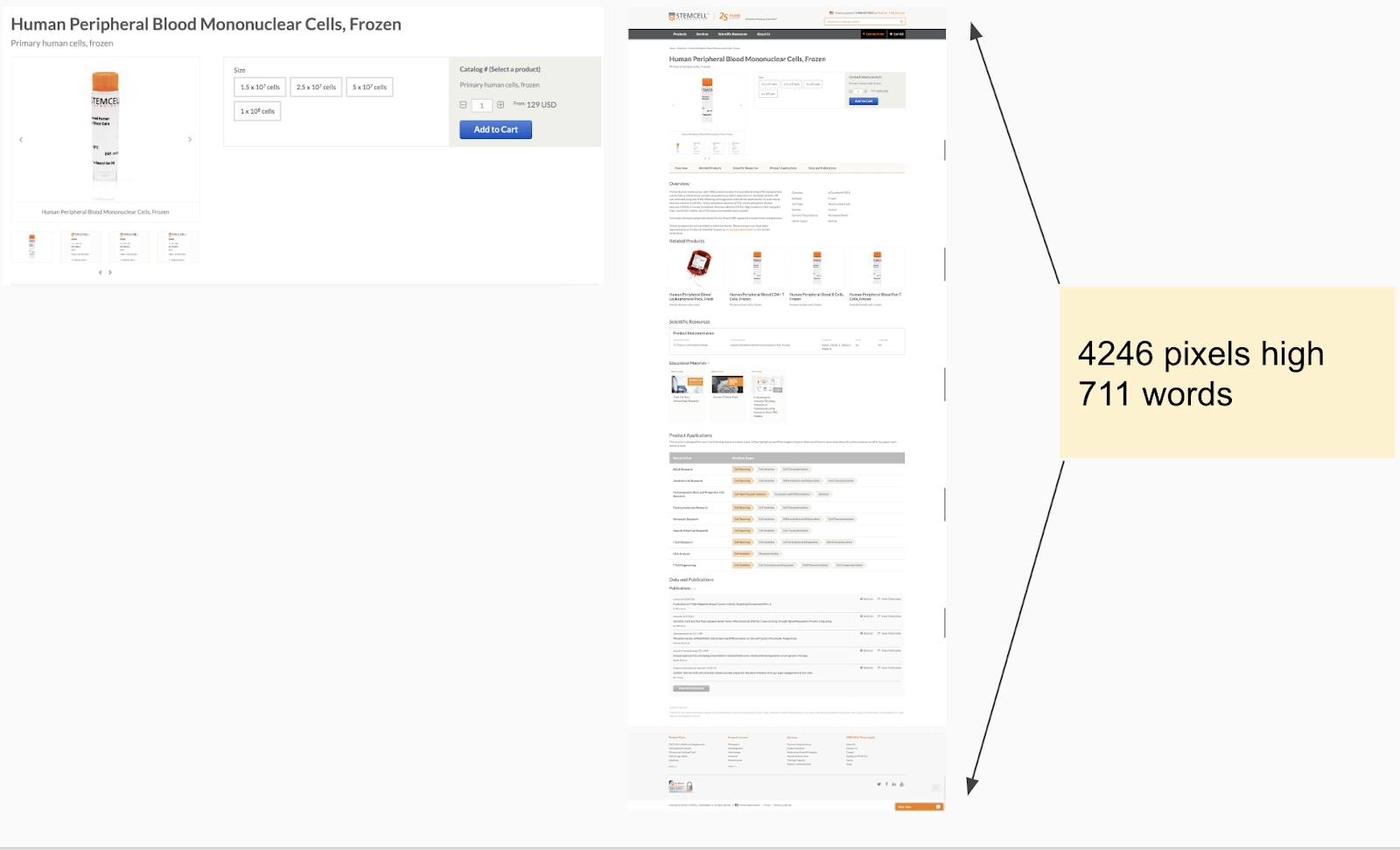
Stemcell – Human Peripheral Blood Mononuclear Cells, Frozen
Stemcell product pages are very well executed. They are content rich and use a helpful sticky bar to allow users to jump to relevant sections of the page.
Main product page sections:
- Product (image, quantity, add to cart)
- Overview (features, kit contents)
- More information (includes video)
- Choosing a VECTASTAIN ABC Kit (step-by-step guide)
- Safety information
- Protocols/Data Sheets/SDS
Stemcell: A Closer Look At Research Areas & Workflow Stages
Vector Laboratories
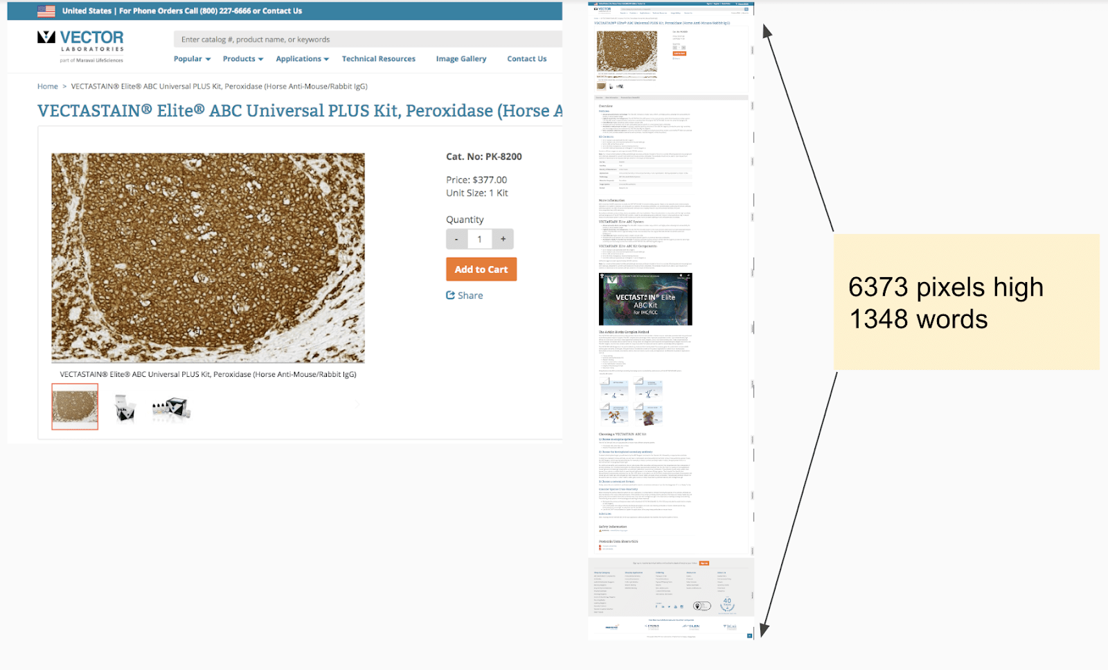
Vector Labs – VECTASTAIN® Elite® ABC Universal PLUS Kit
Imaging quality is a critical differentiator for Vector products themselves, so it makes sense to focus a large amount of visual real estate on the product image. You’ll also see that clicking the images expands to a full-screen view for an ever deeper look.
Main product page sections:
- Product (image, quantity, add to cart)
- Overview (features, kit contents)
- More information (includes video)
- Choosing a VECTASTAIN ABC Kit (step-by-step guide)
- Safety information
- Protocols/Data Sheets/SDS
Illumina
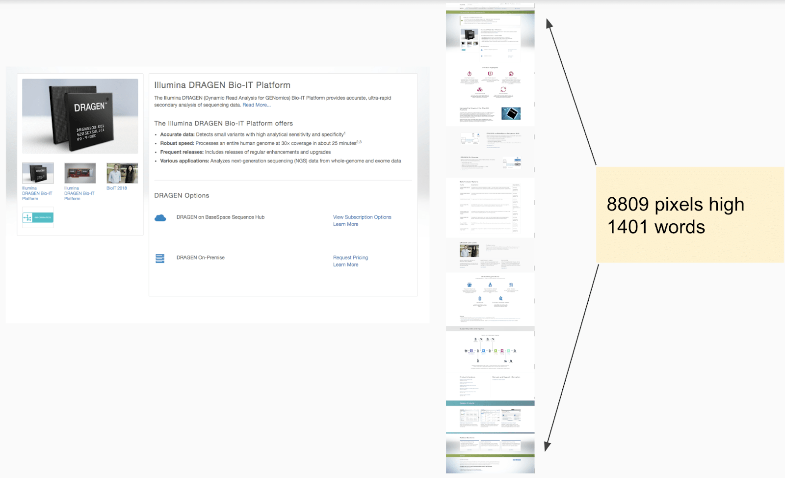
Illumina – DRAGEN Bio-IT Platform
Throughout Illumina’s expensive site (over 26k pages are indexed on Google), they are using many long form sales and education pages. These pages are optimized for both conversions with clear call to actions and SEO (they are ranking for over 46k keywords that are driving over 146k organic users to their website per month)
The Illumina DRAGEN product page includes:
- Product description, images, and videos
- Product highlights (with icons)
- Data Analysis Options (chart)
- Use cases (videos, interviews, and stories)
- Applications
- Supporting data and figures (pipelines diagram)
- Product literature
- Manuals and Support Information
- Related products
- Related solutions
But what about product detail pages from outside of life sciences? Let’s take a look at examples from Amazon and Apple product pages.
Amazon
All-New Fire 7 Tablet (7″ display, 16 GB) – Black
If there’s one place on the internet that has their product pages down, it’s Amazon.
Amazon is no stranger to long from product pages. When you’re browsing Amazon yourself, it probably doesn’t “seem” like the pages are all that long because they contain such useful information – like customer ratings & reviews, personalized recommendations, and lots of images.
Amazon has entire wiki sections devoted to educating their sellers on product detail pages and offers.
From Amazon:
[Product detail pages are] a shared space that displays attributes that are common to all offers for the product, such as the following:
- Title
- Image
- Bullet points
- Description
- Product variations (such as size or color)
- Customer reviews
It makes complete sense that Amazon has strict guidelines and formatting for their product detail pages.
Apple
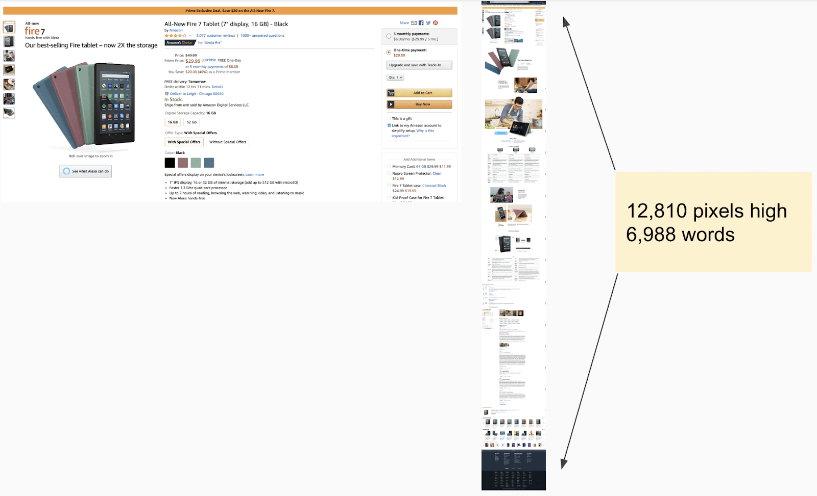
Apple of course is always going to do their own thing. The new iPhone 11 is a great example of an extremely long form page, 54,279 pixels long to be exact. Although Apple and Amazon take very different approaches to the design of their pages, they both know that long pages actually sell.
Don’t Fear Long Product Detail Pages: They Work
The moral of the story: buyers scroll. If you give people helpful, relevant, and personalized content in multiple mediums (text, image, and video) you will be rewarded with more traffic and more sales.
4. Upsells & Cross Sells on Product Pages
We’ve all used Amazon for shopping. Relevant product recommendations, add-ons, & alternatives are becoming expected in an online shopping experience.
Whether you’re shopping for airpods or antibodies, relevant and personalized recommendations are quickly becoming an online standard.
Abcam Uses “Add Both to Basket” Upsell
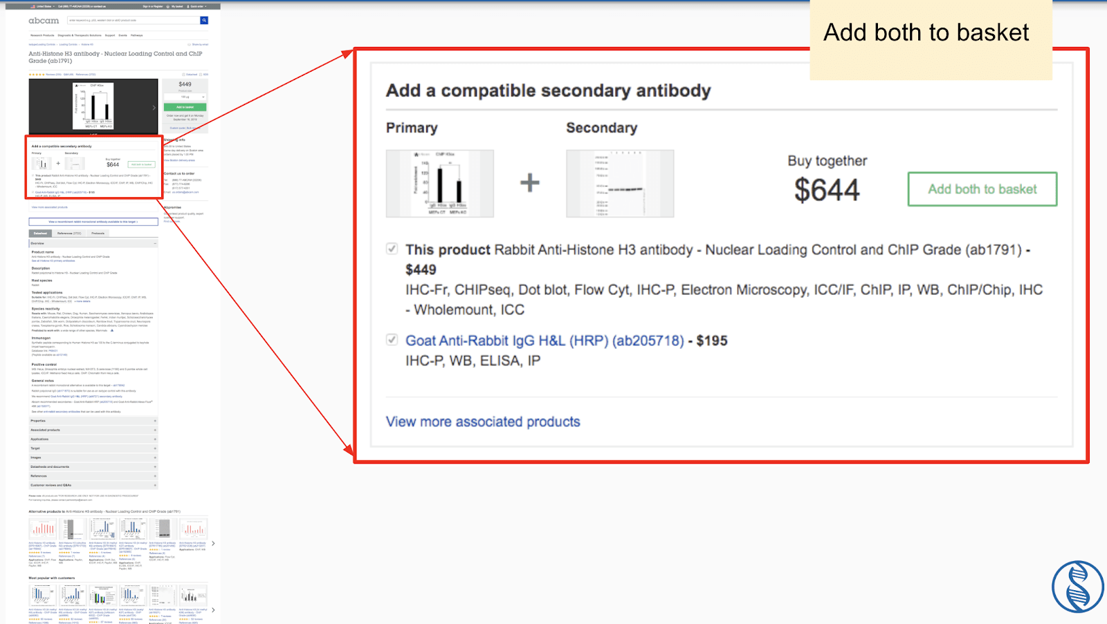
Anti-Histone H3 antibody – Nuclear Loading Control and ChIP Grade (ab1791)
Similar to Amazon’s product bundles, Abam has started implementing “buy together” call out boxes under the main product image for select products. Currently there is no savings offered for shoppers who use the “buy together” option. However, testing a “bundle and save” offer would be a smart test for Abcam to run.
Alternative Products, Most Popular, Recently Viewed (Personalization)
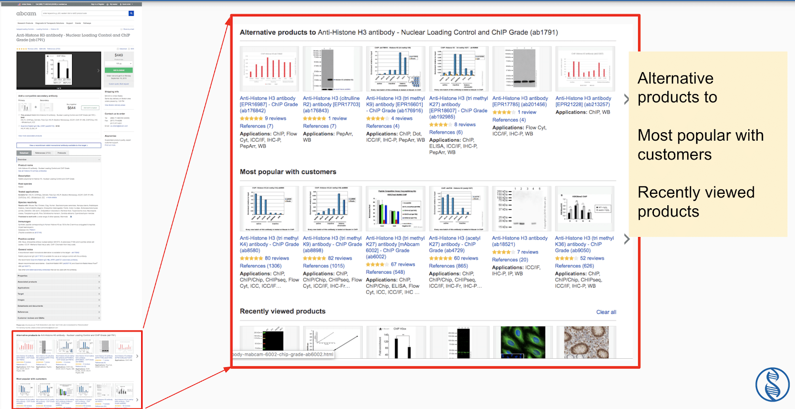
Anti-Histone H3 antibody – Nuclear Loading Control and ChIP Grade (ab1791)
Further down the page, the shopper will also see three rows of suggested products:
- Alternative products
- Most popular with customers
- Recently reviewed products
The last row is a personalized list based on each shopper’s browsing history. “Recently viewed” is an often overlooked, yet simple personalization tool that can increase sales.
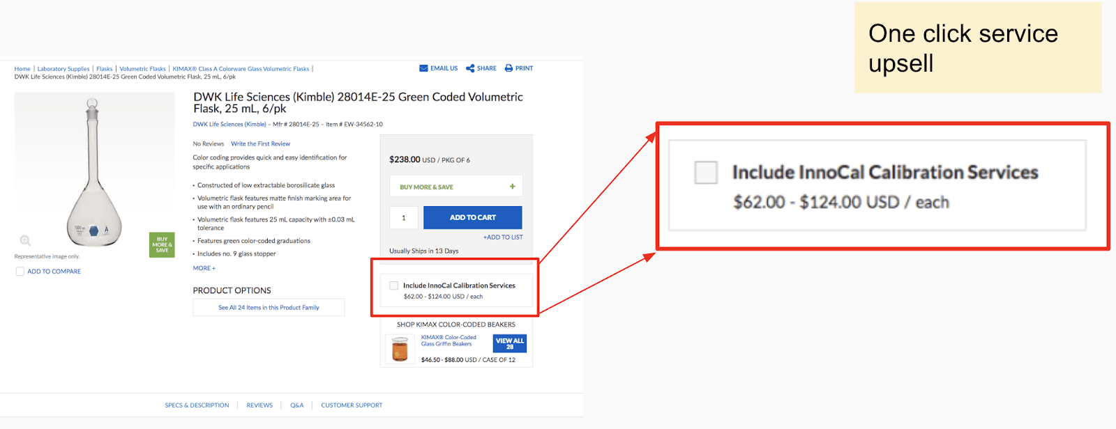
Cole-Parmer Uses a “One Click Upsell” Service Under “Add To Cart”
Cole-Parmer – DWK Life Sciences (Kimble) 28014E-25
Because of the complex products and highly consultative sales cycles common in the life science industry, it’s typical for companies who are selling online to also offer services paired to their products.
Cole-Parmer has found a simple solution to drive awareness and sales of their calibration services by placing a “one-click” upsell directly under the “Add to Cart” button.
One UX issue that could be improved here is clearer access to information about what this calibration service is. Currently the user needs to select the checkbox then select the specific sub-service. The sub-service options are linked to their down description pages. However, they are currently hidden behind the first checkbox and could be missed.
Overall, this is a great design that takes advantage of extremely high-value page real estate (directly under the CTA). Are there any “one-click-upsell” opportunities your website is missing?
5. Live Chat in Bottom Right Corner
Prospects who are researching your product or service want fast, friendly facts. Live chat is the easiest way to deliver that.
Live chat is a great way to instantly increase inquires because it simply sits on top of your existing website.
Typically, you’ll see Live Chat sit on the bottom right corner of the screen. This is quickly becoming a standard web practice.
STEMCELL: Choose a Department
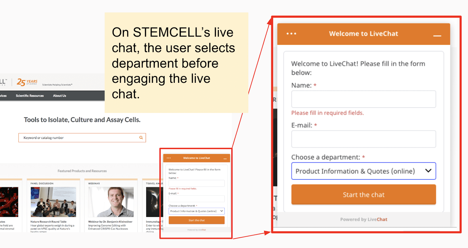
Of the life science live chat pages examined, STEMCELL has the highest barrier to engagement for users. In order to chat, the user needs to fill out his or her name and email, and then choose a department. This isn’t necessarily a bad thing, especially if it results in more accurate support and higher conversions. However, the requirement of fields will dissuade a percentage of users from engaging compared to an open chat field.
Solution used: Live Chat
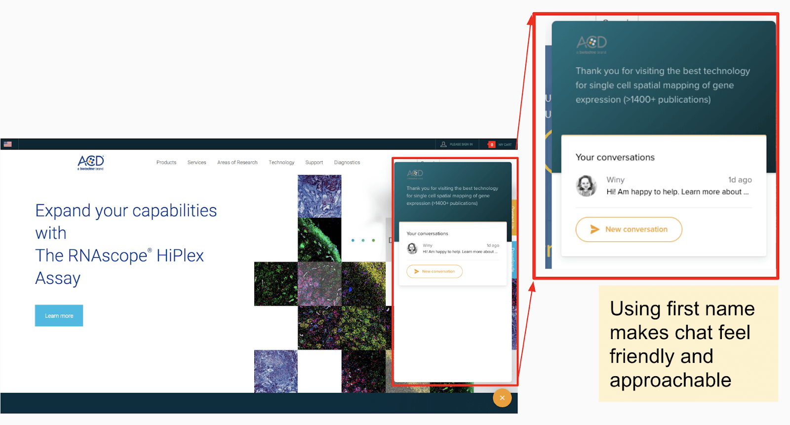
ACDBio: Uses first name
ACDBio has personalized their live chat with the first name “Winy” and a friendly product avatar. ACD has also added a value prop into the live chat dashboard itself:
“Thank you for visiting the best technology for single cell spatial mapping of gene expression (>1400+ publications).”
Solution used: Intercom Live Chat
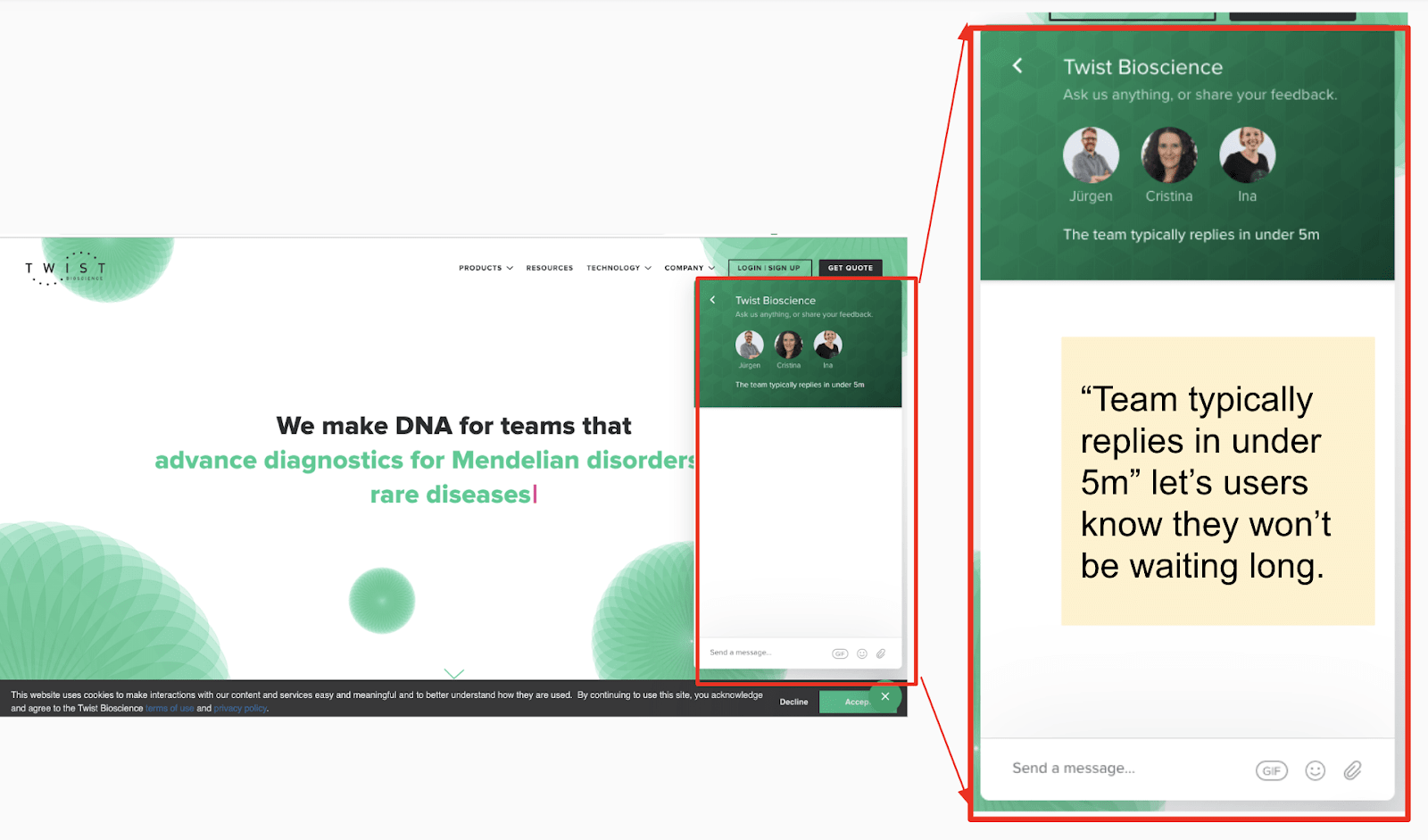
Twist Bioscience: “Team typically replies under 5 minutes”
Twist Bioscience is using a message that reads, “The team typically replies in under 5m.” This is an important message to let visitors know they won’t be waiting long for a response.
One piece to note: most companies are also taking advantage of the custom color feature to create a seamless brand experience from website to live chat. Twist is a good example of this carrying over the strong green and geometric shapes from website to live chat.
Solution used: Intercom Live Chat
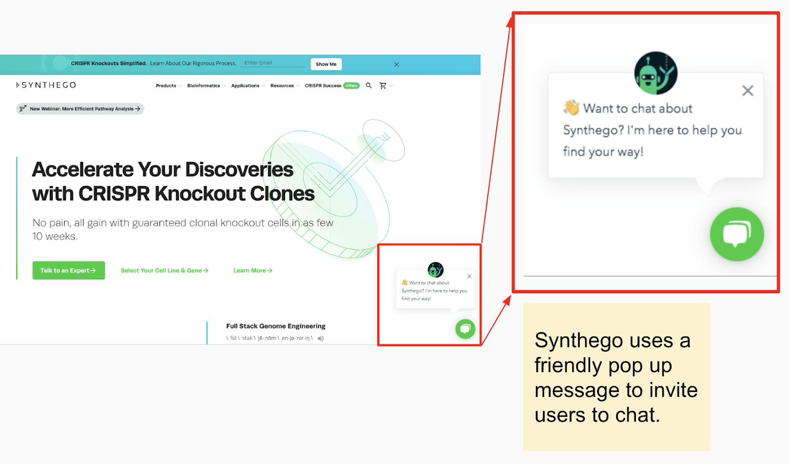
Synthego: Pop Up Message
Synthego is the only company examined that uses a pop-up message in addition to the live chat icon.
Solution used: Hubspot Free Live Chat Software
6. The Big Guys Are Doubling Down AdWords (Up 200% from 2017)
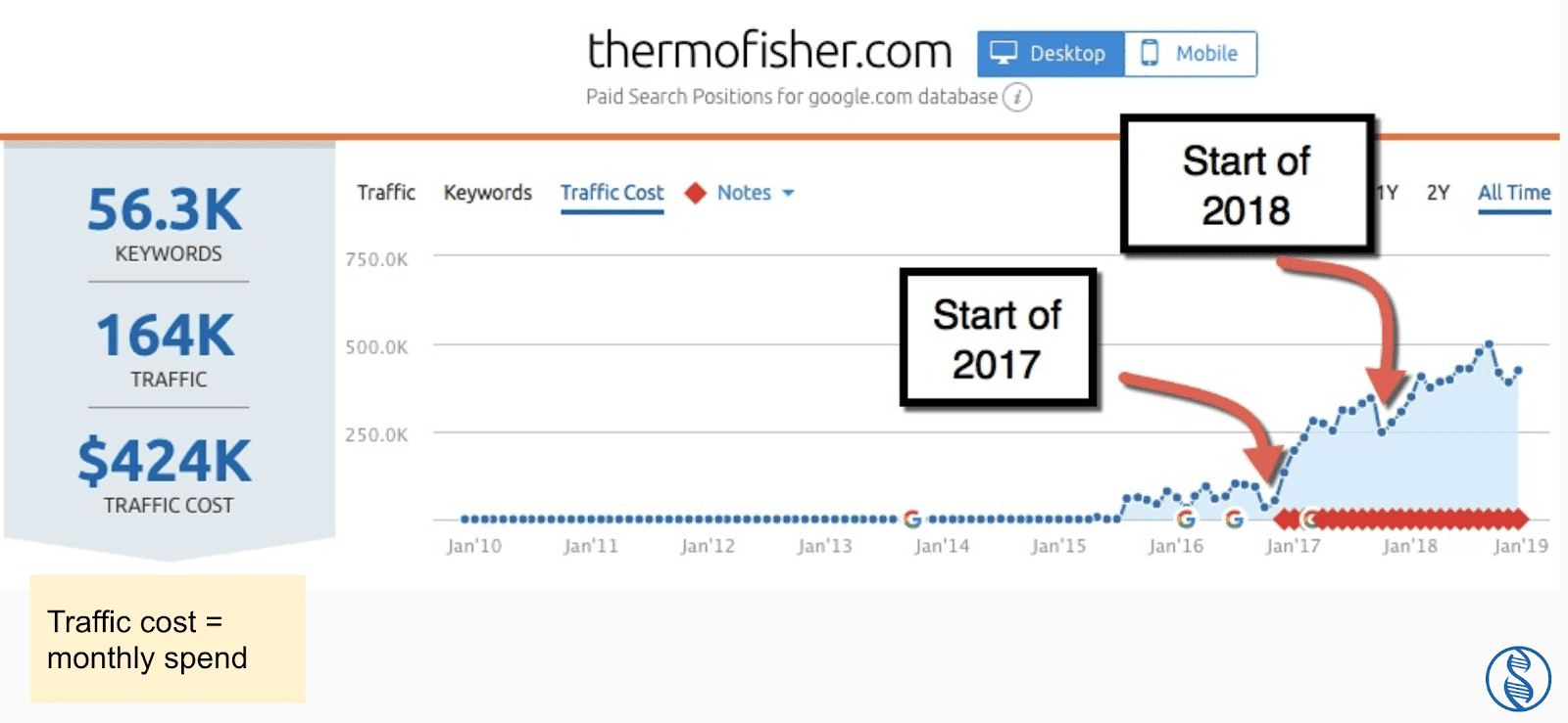
In 2017, we saw Thermo quadruple their ad spending on AdWords. In 2018, it was closer to doubling their ad spending. (So, that’s a total of 8x as much spending since 2016.)
According to SEMRush.com, Thermo has slowly increased its budget on AdWords, month over month. They maxed out at about $500,000/mo (or $6,000,000/year).
Read more: 5 Lessons I Learned from Working 24/7 with the Top Life Science Companies in 2018
What digital marketing trends have you noticed in the life industry? Drop us a comment below. We’d love to hear your perspective.
If you enjoyed this article and would like more free life science marketing tips, reports, and tools, then sign up to our email list.
If you believe your company is ready for digital transformation, contact us today to set up a free consultation.
Related Posts
Get a Quote or Ask a Question
- Curious about our process or pricing?
- Need help getting buy-in?
Contact us right away — we’d love to help.
Let’s take a look at your website together and figure out your best options for business growth.

Contact us right away — we’d love to help.
Let’s take a look at your website together and figure out your best options for business growth.

